I posted the result on http://www.typewriters.ch/blog/2017/01/typo-360/
I hope you enjoy! http://www.typewriters.ch/blog/2017/01/typo-360/


 Labels:
Brexit,
Empire Junior,
typewriter
Labels:
Brexit,
Empire Junior,
typewriter

 Labels:
book,
Europe,
The Typewriter Revolution
Labels:
book,
Europe,
The Typewriter Revolution
 |
| April 1913 cover of Mon Bureau. This French office magazine was edited by G. & M. Ravisse in Paris. Is it Monsieur Gaston Ravisse himself on the cover? Compare with the photograph below. I think there is strong similarities, down to the pince-nez (weak but visible on the photograph) |
 |
 |
| This is Hermes, or Mercury. Very fitting for a business magazine. Hermes holds the telegraph wires and literally uncovers or holds his protective hands over a contemporary office. W. Fel's signature on the lower right side. |
 |
| There we go: Hermes, adorned with the very Mon Bureau magazine, looks triumphantly on what might be St. Sebastian, speared by a giant quilt, symbol of the old office world. |
 |
| Sexy Hermes - please notice the winged heels - overlooking the city and the port, sends out the merchant ships. In his left hand, the herald's staff with two intertwined snakes. |
 |
| September 1913 issue, William Fel differently. A serious yet confident-looking business man. |


 |
| The first issue of 1914. William Fel cover again, Hermes / Mercury again, but a different atmosphere. A serious-looking God of commerce, with belching smokestacks in front of a fire-red sky. |
 |
| The February 1914 edition. An interesting compound of a sprocket, symbolizing mechanics, and Hermes' symbols, the herald's staff and wings. |
 |
| Gaston Ravisse again? Yes I think so! |
 |
| An animated business meeting. One of the participants, however, is pensively looking at the opposite factory. |

 |
| Looking for the shiny white factory on the hill on the horizon. |
 |
| A good working climate keeps the smokestacks smoking! |
Labels:
1910s,
1913,
1914,
bureau,
bureautica,
Gaston Ravisse,
illustrations,
Illustrator,
magazine,
Mon Bureau,
office,
Ravisse,
William Fel


 Labels:
Early Typosphere
Labels:
Early Typosphere
 |
| Moby Dick, made in 1948. It followed me home. Typosphere magic: RobertG of backspace does not erase also features a late Adler in today's post. |
 |
| Moby Normal, 1930s |
 |
| Adler flatbed writer, or rather, screenwriter |


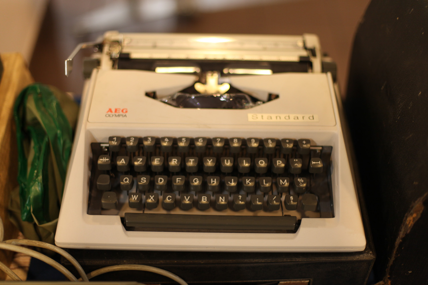 |
| AEG Olympia Standard - now this is a puzzle for a collector. Anyone knows about this model? |


 |
| The first Caligraph - or is it a Frister & Rossmann? |
 |
| The second Caligraph - nice! As always, with the famous spelling mistake (it should be "calli") |

 |
| high on my wish-list: The Chicago, with its intriguing typing mechanism |
 |
| We type Chinese! |


 |
| Contin, aka Remington 3, in beautiful deep blue |
 |
| It's France, so plenty of Dactyle-Blicks |
 |
| Yes!! I got this one! It's a Dactyle 3, equivalent to the Blick 7 |
 |
| The Dactyle company also labelled calculating machines |
 |
| all right, there is one S.P. Blick |

 |
| Ah, one Etoile with original spool covers - they are usually missing, although they can be replaced by a Hermes Standard 3 or 4 typewriter spool covers (which of course requires you own one) |
 |
| A Hermes Ambassador, guinea-pig edition |

 |
| Here is something special: it's the first Japy standard typewriter, a Model 3X. Even more special, this one still has "Remington-Sholes" written on the front (to complicated for me now to add the detail picture, this primitive blogger software is really driving me nuts, highly complicated to add one more picture in between - blogger.com software specialists, take wordpress as an example!!). The story goes that the first of the Japy series were still produced in the U.S. and only mounted in France. Something to follow up. Who knows facts? |
 |
| A Japy 3Y, already labelled "BEAUCOURT - JAPY FRERES & Cie - PARIS" |
 |
| In Lambert paradise |
 |
| ... and one more |

 |
| This L.C. Smith is special - according to the seller, it is one of the D-Day typewriters - wow! |
 |
| ok, Mignon - NICE!! |
 |
| Mignon 2 - would also be my choice |
 |
| A model 3 |
 |
| and a Model 4 (with backspace key) |
 |
| Monditype - I like it. And it followed me home |
 |
| Ochydactyl - train your fingers till they hurt |
 |
| Odoma. I find the design very classy |
 |
| Portex Portex! with glamorous finishing |

 |
| Yes!! top of tops - a Sholes & Glidden. It was sold in good old Vienna, when the Emperor was still young |


 |
| It really is a privilege to inspect such a beautiful machine close-by |


 |
| The Toshiba Typewriter |


 |
| Also on my wish list - a TYPO. When is Christmas 2017? (I already got myself presents for 2015 and 2016) |
 |
| Behold! A seemingly innocuous Underwood, but from the bottom of the case unfolds a support for typing in the field. The perfect typer for a type-in with "bring your own table" |
 |
| The Williams density at the meeting was uncanny - five machines spotted!! Maybe it's not rare after all? :) |


 |
| I find the tab keys of this Yost particularly charming |

 |
| and what a beautiful case with faux-woodgrain finishing |

